
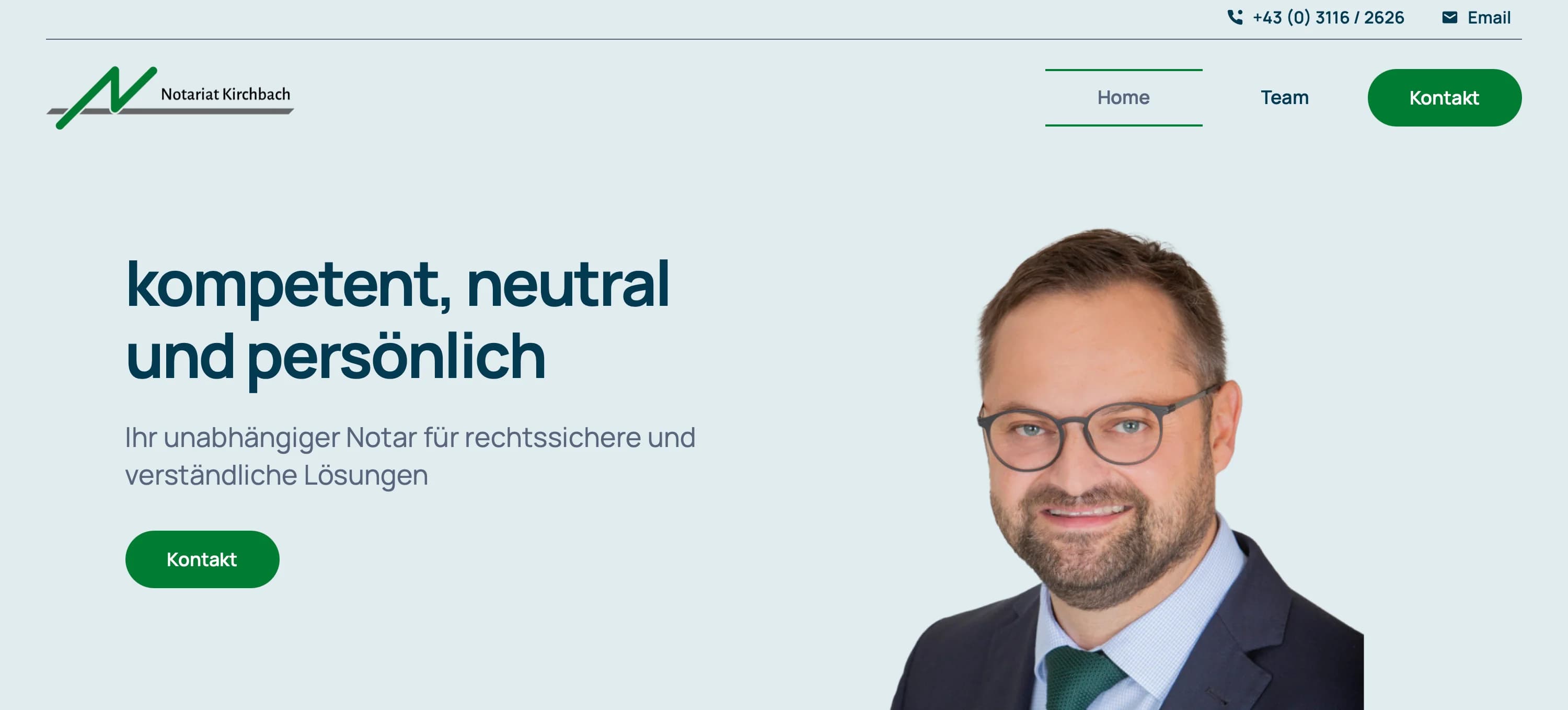
A notary does not sell — they create legal certainty
A notary's office is a special case. Unlike a law firm that takes one side, the notary is a neutral office holder: they authenticate, certify and advise impartially — in the service of legal certainty, not of one party's interest.
That places an unusual double demand on the website. It has to radiate authority — binding, legally sound work happens here — and at the same time be approachable, because most people come to a notary in a tense moment of life: buying a house, an inheritance, a business succession, a power of attorney.
That was exactly the brief for the relaunch of Notariat Kirchbach-Zerlach, the practice of Ing. Mag. Franz Valentin Löffler in Styria, Austria: to create a presence that conveys reliability without feeling remote.
The starting point: a grown WordPress site
The previous presence ran on WordPress — grown over the years, extended with plugins, functional but slow and hard to maintain. The underlying problem is typical: a website that was set up once and then only patched here and there, until structure and load time no longer matched the standard of the actual work.
For a trust profession, that is more than a cosmetic flaw. When the site stutters on a smartphone or looks dated, that impression unconsciously transfers to the competence behind it — before a single sentence has been read.
Three decisions that shape the presence
1. A design that combines neutrality and closeness
We chose a clear, calm layout: generous whitespace, strong, highly legible typography and the brand's green as a restrained accent. No stock-photo pathos, no cluttered navigation. The result feels serious and orderly — while leaving room for the notary to come across as a person, not just an office.
2. Services you understand without legal jargon
Real estate law, inheritance law, corporate law, certifications — routine for professionals, often unfamiliar territory for clients. We structured the services clearly and in plain language, so visitors recognise within seconds whether their concern belongs here. Clarity is not a design detail here; it is the actual service to the user.
3. "Rechtswissen": making complex topics accessible
A dedicated section explains legal fundamentals for non-specialists — what happens during an authentication, how an estate is settled, what a precautionary power of attorney is for. This positions the office not only as a service provider but as a reliable point of contact, and along the way it strengthens visibility for exactly those search queries.
Technically: from WordPress to Next.js
Instead of patching the old system further, we rebuilt from scratch — with Next.js, as with all our projects. The reasons:
- Server-side rendering for instant load times on every device — no more plugin ballast
- Optimised image processing with next/image (WebP) that carries the design without delay
- Local SEO for searches like "Notar Kirchbach" or "Notar Steiermark" — semantic HTML and structured data from the start
- Accessibility to WCAG 2.2 AA, so the site is genuinely usable by everyone
The result: Lighthouse scores above 90, fully responsive from a 320px smartphone to desktop.
What this project shows
For a neutral office holder, the website is not a sales brochure but a promise: careful, reliable and understandable work happens here. A fast, clear, well-maintained presence makes that promise tangible at first glance — and replaces a grown WordPress structure with a foundation that lasts for years.
If you would like to see the result: kirchbachnotar.at
And if your own presence is showing its age — whether a notary, a firm or a business — get in touch. The first conversation is free and non-binding.